


As part of my professional UX diploma by the UX Design Institute I designed a website for an airline called Fly UX. The course work gave me the opportunity to put my learnings into practise and familiarise myself with every step of the UX design process whilst implementing best practices and design principles.
Overview
Designing an airline website, research, design, and prototype the search and booking process
Client
Fly UX (UX Design Institute)
My role
To carry out competitive benchmark and user research to identify good experiences and pain points user find when completing search and booking a flight. I then applied the findings to designing, prototyping, and testing a new website
Tools
Sketch, InVision, Figma, Adobe Creative Suite, ScreenFlow, Loom, Miro, Keynote, Microsoft Office, Pens, Paper and Post-Its
The full process
The objective of the project was to embed fundamental UX concepts into my mind, see UX as a coherent discipline and as a structured process and understand how best practise can minimise risk. I worked through the full end-to-end design-thinking process from identifying the problems and challenges that the users commonly faced, to sketching ideas to solve these problems and designing a prototype that I validated with real users.
By observing and analysing what other airlines were doing, I was able to learn from what became frustrating for users and emulate what they did right. I also gathered and analysed both quantitative and qualitative data on users. I used this information to focus my research, inform my designs, and to create user-focused solutions.

Research - what works and what doesn’t...
Online survey
To gather some quick insights I created a survey to learn more about the goals of people that use airline websites and apps - what are they trying to do, what (if anything) is preventing them from doing it, what else would they like to be able to do on airline websites and apps, the specific goals of users as well as the experience that users had of the flight booking process. The survey was short and easy to complete under five minutes. The survey was completed by 15 participants.
27% of people were not able to complete their task
I want it to “Load quickly and I could see what I needed clearly and easily”
Price and Date ranked the highest in priority
Users want more clarity “Baggage, seat reservation and extra costs should be clear”
13% of users needed to seek help
Users like being able to “Comparison of flights and prices”
Competitor Benchmarking
I looked at 3 competitor airlines and 1 aggregator site. I chose a mix of budget and long haul airlines to see how they approached the booking process differently. The aggregator site provided a different take on information displayed and the final payment was able to learn how best-in-class websites and apps solve the problems we are trying to solve and understand the conventions I should follow.

What I learned
Good - we love this
-
Simplicity in layout and brand.
Search form easy to complete and
no hidden fields -
Summary and itinerary on the right hand side is useful
-
Automatic tabbing - the cursor moves to the next field once you complete the previous one
-
Clear language and field labels
What was expected
-
From, To, Date and Passengers fields in search box on homepage
-
Scroll through comparison dates ‘next 7 days’
-
Can compare cabin fare and see different benefits
and what was frustrating
-
Promos, discount clubs and fee not obvious
-
Can’t type in field, only select date or airport
-
No ‘information' links


Usability Test
I ran a usability test to get some context
-
Why people use airline websites?
-
Who they travel with?
-
What they are trying to do?
-
How they navigate through the site
-
What their expectations are?
-
What pain points they may experience
-
and how they would try to resolve them?
I created a usability test script to prepare myself for the session, and to make sure I wouldn’t be asking any leading questions. Using ScreenFlow and Loom I was able to watch what participant as they completed the task. I then analysed the recordings to gather my insights in a note-taking exercise.
“Mary notices she may not be able to bring hand luggage on plane with her. This makes her wonder if she needs to prepare for this in advance”
Key Insight: The usability tests and depth interviews provided an opportunity to dig deeper into users actual behaviours. What you think you do is not always what you do. Observing their behaviour and asking questions helped me understand the users actions better.
Analysing the data
- what does it tell me?
Through the online surveys, competitive benchmarking, depth interviews, and usability tests, I gathered a large amount of quantitative and qualitative data that identified the problems that Fly UX should be solving. The next step was to organise and make sense of data.
Affinity diagram
Working in Miro I ran an affinity diagram session with another designer. Here we sort through both data we captured. We started by trying to group them into similar comments and them grouping into stages of the booking process. This session helped me analysis the data into what worked and what needed more consideration. I could then start making some design decisions.


Customer Journey Mapping
Alongside the affinity map I created a customer journey map to get a good overview of the entire journey the customer goes through when booking a flight. I noted their goals, behaviour, expectations, the context of booking and emotions at each step.
Key Insights
Users start this process at a peak, excited to travel. This stage of the journey is most positive and well as when they start entering their search details. Most airlines have made the homepage user friendly and the user is able to find the task they need to complete without it being too complicated. Some low budget airline has a fussy page which can be too distracting at the start of this process.
Results pages can become complicated to understand and frustrating when there is too much information dissect. This can lead to the user feeling they are being miss-sold and overloaded.
There is always a sense of relief at the end... and excitement.
Simple easy to complete payment page with inline validation made this process easy and smooth.

"I'm not here for inspiration, I'm here to look a flight"
Design - Defining the high-level user flow and solving the problem
Flow Diagram
The goal of my flow diagram was to define a high-level flow for the airline desktop website, focusing on one primary use case and their happy journey. In reality, I would have needed to design multiple flows to ensure I had covered all the major user cases.
The process
Step 1
I started by reviewing the affinity diagram and customer journey map, focusing on the user good experiences and pain points, and understanding where they occurred.
Step 2
Next, I sketched out how the user would ideally flow through the airline website, based on making a return flight booking for one passenger. I used a rectangle for each screen state and a circle for each action: one state – one action – one result.
I developed and added more detail on each iteration, including each screen state and interaction that the user would click through.
Step 3
I finalised the flow diagram by creating a digital version in InDesign that demonstrates how the user can move through the process as efficiently as possible, adding colour to the diagram to represent each stage in the booking process.

My happy journey user flow is simple, with 7 screen states all familiar to the user using current best practise. When taking into account all actions between each screen it began to look more complex but very relevant as each action would need to be considered and validated to make sure the 'happy journey' stayed happy.

Key Insights
-
The importance of sketching
-
Initially I sketched the flow diagram to map out the process. The flow took longer than expected to draw, which shows how many action points need to be considered. This was useful to do and easier to adjust through sketching.
-
Only six screen states
-
Whilst the flow diagram looks complicated it clearly showed 6 screen states. I was able to leverage the industry standards to make sure the journey was simple and familiar.
-
Finding the best and second best route
-
As much as the journey was a simple task I found I had to consider alternate flows for this too. It made me conscious of the routes users could experience and how simply they can be embedded.
Sketching the screens
Interaction design
Using my user flow diagram I started sketching the screens stages. Initially I started with a simple sketch then I started to redraw and address the pain points highlighted in my research. Once I completed the journey I spend some time analysing and noting any inconsistency for further sketching until I was happy. I even prototyped a low fidelity mockup using my sketches to check I had all screens.
Simplicity is key
I designed the search form to hold all the key fields users expect with is sitting above the fold in the window. I wanted it to be clear and simple to complete, to not overwhelm the user.
Click and Type
I wanted the user to be able to 'type' or 'select' where possible. The research showed a preference for both and I wanted to match more natural behaviour. Some users felt moving from cursor to keyboard required effort.
Prototype - Digitising the designs and adding interactivity
The next step was to build a prototype and to digitise the designs. I wanted to ensure that the prototype contained enough detail and interactivity to test the high level flow, screen layouts, text, and basic interactions.
Creating a basic version in Sketch allowed me to work quickly and make simple design decisions. I was able to make iterations quickly where needed and see a working flow to test.

Summarise where possible
My research showed a liking for a summary or itinerary on every page. As this was important I emphasised this on the page at the top with the option to edit if necessary and then a detailed summary at the end of the process at the payment stage.


Final prototype with some Branding
I felt the medium fidelity prototype translated the user flow well. It showed a smooth booking process, end to end, but I felt it lacked some affordance which UI could provide. To improve the prototype for user testing I decided to add some branding to make the experience better.
I was able to import my Sketch screens into Figma, add branding elements. I further refined my designs and making improvements as I progressed. Again, I used InVision to bring it to life adding interactions.
Insights
Adding branding and UI solved the following problems highlighted in my research:
-
Difficult to find search/CTA buttons, not big enough or colour not vibrant enough
-
There was not enough information when errors where made when completing a form
-
The layout is too busy and distracting


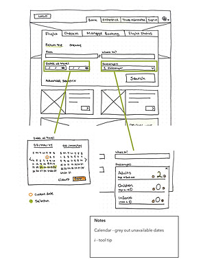
Wireframes - with handover notes
Creating annotated wireframes is a vital part of the development process and gave me the opportunity to define the extra details that developers need to build the product accurately.
I created a set of annotated wireframes in Sketch, that specified the behaviours, rules, controls, and feedback for each aspect of the website.
The objective was to remove any ambiguity by clearly telling developers and others how the application works. The challenging and most time-consuming aspect was detailing each function that the forms should perform, including all errors and the feedback for each error.
VIEW FULL HANDOVER NOTES

